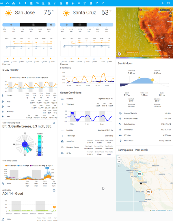
I used to think my weather dashboard in Home Assistant was pretty good. It had what I thought was everything I wanted: current and forecasted weather for San Jose and Santa Cruz, detailed information for the sun, the moon, tide and ocean conditions, even recent earthquake data showing magnitude and location. I was pretty jazzed to have all of that data together and easily accessible.
But in time, I realized my dashboard had a problem. It wasn’t organized in a way that made it easily consumable. There was some structure to the layout, but it lacked a clear focal point when displayed on a desktop, and it was basically unusable on mobile. Text was frequently truncated and the data load caused what felt like endless scrolling. So what I thought would be enjoyable in concept turned out to be frustrating in reality. It was neither fun nor informative.
So if I ever wanted it to be useful, it was clear I was going to have to do something different. I started to consider this problem as a background activity to last summer’s Olympic games and probably had most of the revamped dashboard put together by the fall. At the time, my goal was to make it more useful than some of the widely available weather apps. Eleven months later I still think the changes I made are fun and its been my default source of weather data ever since.
The setup was a little involved, but I figured I’d post the details if someone is looking to do a little more with their own dashboard.
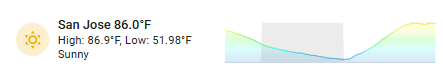
For context, here is the state of my dashboard at the start of this project:
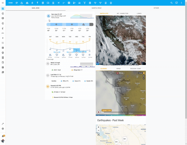
Here’s a quick gif of the dashboard by the end:*
*larger images are available in the Gallery below.
Objectives
I started by defining the objectives that I thought would best address my dashboard woes:
Simplify content and layout.
Develop a framework that promotes simplification yet preserves access to detail.
Ensure data is equally usable in both desktop and mobile environments.
Changes
With those objectives in mind, and after considering various options, I then set about implementing the following changes:
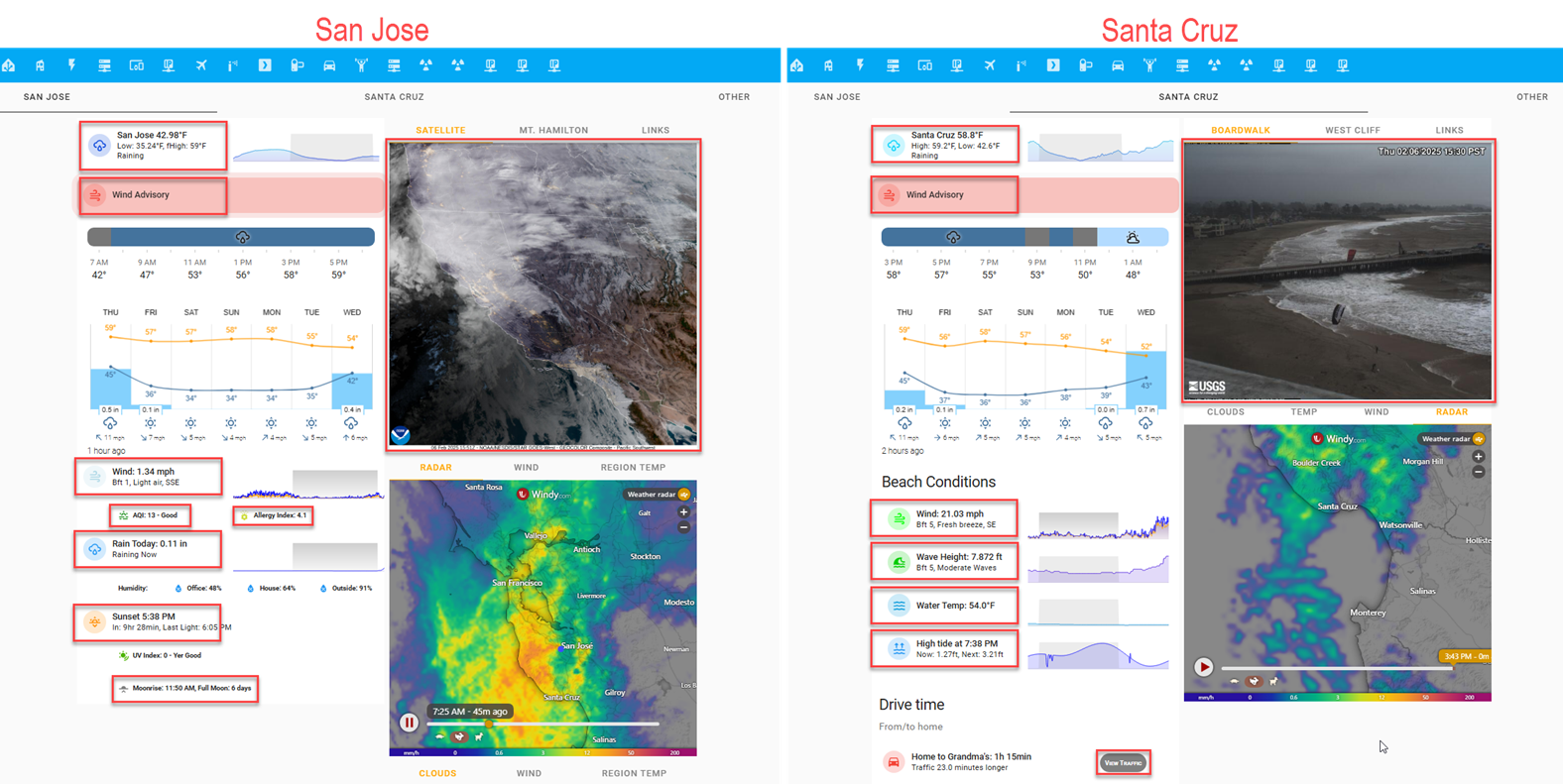
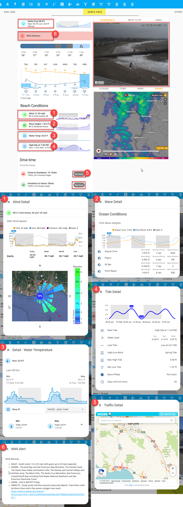
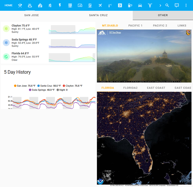
I had San Jose and Santa Cruz weather listed on the same page, but was rarely interested seeing both at the same time. Separating the two seemed like an obvious first step. I thought a tabbed layout would be a good solution. It even allowed me to add an “Other” tab for three other locations I also wanted to track but viewed even less often.
(view larger)
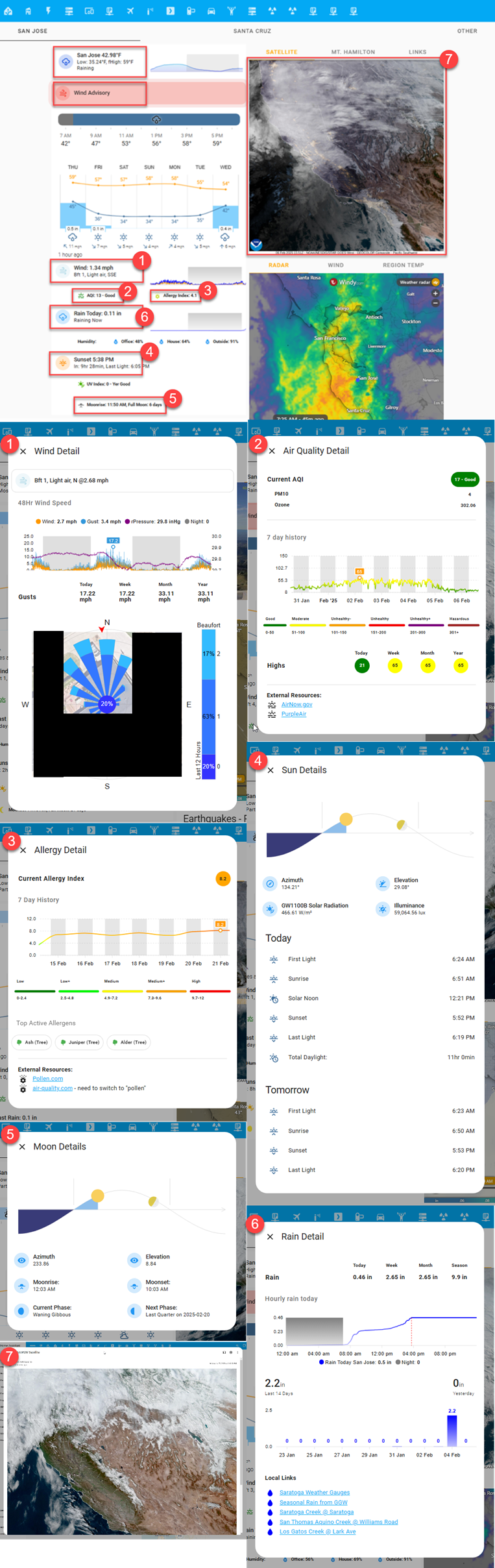
After segmenting locations, I then focused on making the data more useful. I decided to show only “headline” level information on each tab and placed all supporting detail in a popup window that triggers when the headline region is clicked. The red rectangles in the image below (these are not visible in the UI) outline these trigger regions (Note: the Gallery section below has detailed images of each popup).
(view larger)
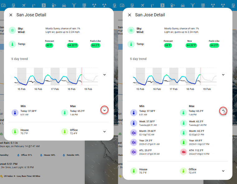
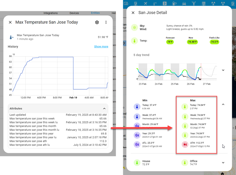
2a. The temperature popup, the first clickable region shown above left, is a good example of the level of detail that was moved to popups. It has a lot detail related to the current temperature that I occasionally want to see, like the five day trend graph. Other information like the weekly, monthly, and yearly min/max temps (below) I want to see even less, but I want those data points available for the times I do want to see them. For these situations, I’ve used an expander card to hide the information by default. Clicking the down arrow will quickly reveal the additional information.
(view larger)
I also wanted the content of each tab to feel dynamic, relevant to the moment, and to aid with understanding. I used the methods described below to help achieve some of this.
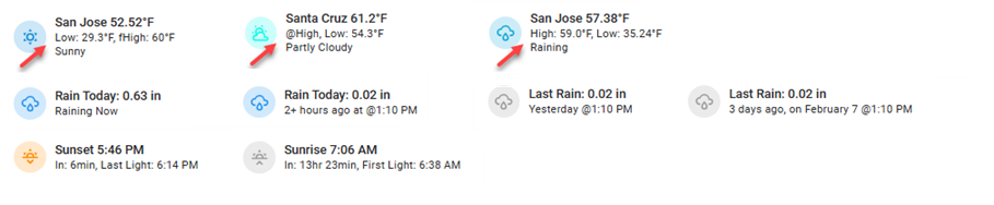
Dynamic Labelling & Text: In many instances the labels adjust to reflect a time-based element about the data they represent. For example, in the image below, the arrows illustrate that the position changes for the low, high, and forecasted high temperature values. In the early morning I want to know what the overnight low was and what the day’s forecasted high (fHigh) is. This is shown with the first arrow. However, in the afternoon the actual high is more relevant to me. If I happen to be looking at it when the temperature is at the day’s high, I want to be informed about it, and if not, I want to see what it was. This is shown with the second two arrows. In the rain example, the text will always tell you the elapsed time since the last rain event.
(view larger)
Icons & Icon Coloring: Weather icons update to show a pictograph of the current weather conditions and use a color gradient mapped to the temperature scale. Other icons change color in a similar fashion. The wind icon color is mapped to a wind speed scale, while others, only change color based on a state. The sun is orange if it is up, otherwise it is grey.
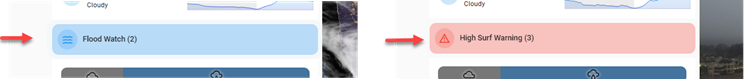
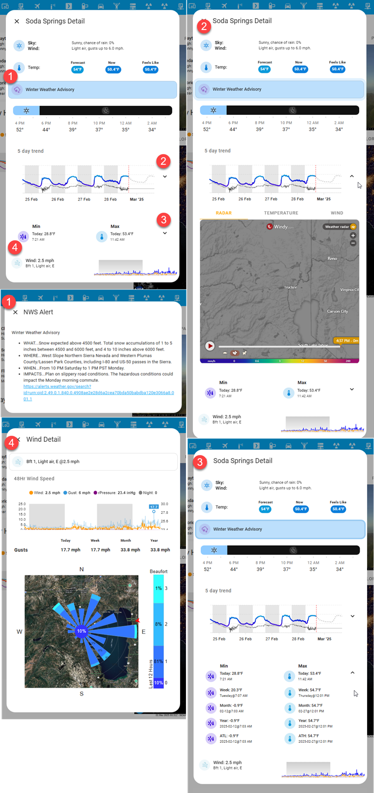
Weather Alerts: Alert notifications are either visible or hidden depending on whether there are any active alerts for the location being monitored. Two different alert types are shown below, though there are many different types possible. These are clickable notifications that will generate a popup to show the alert’s detail.
(view larger)
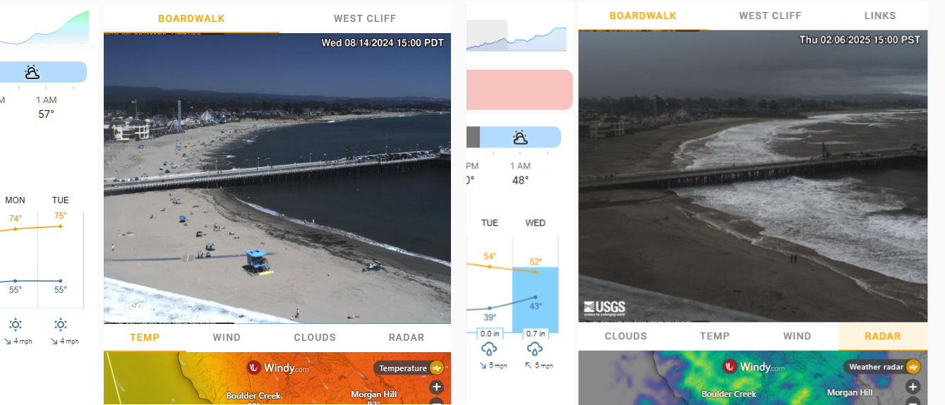
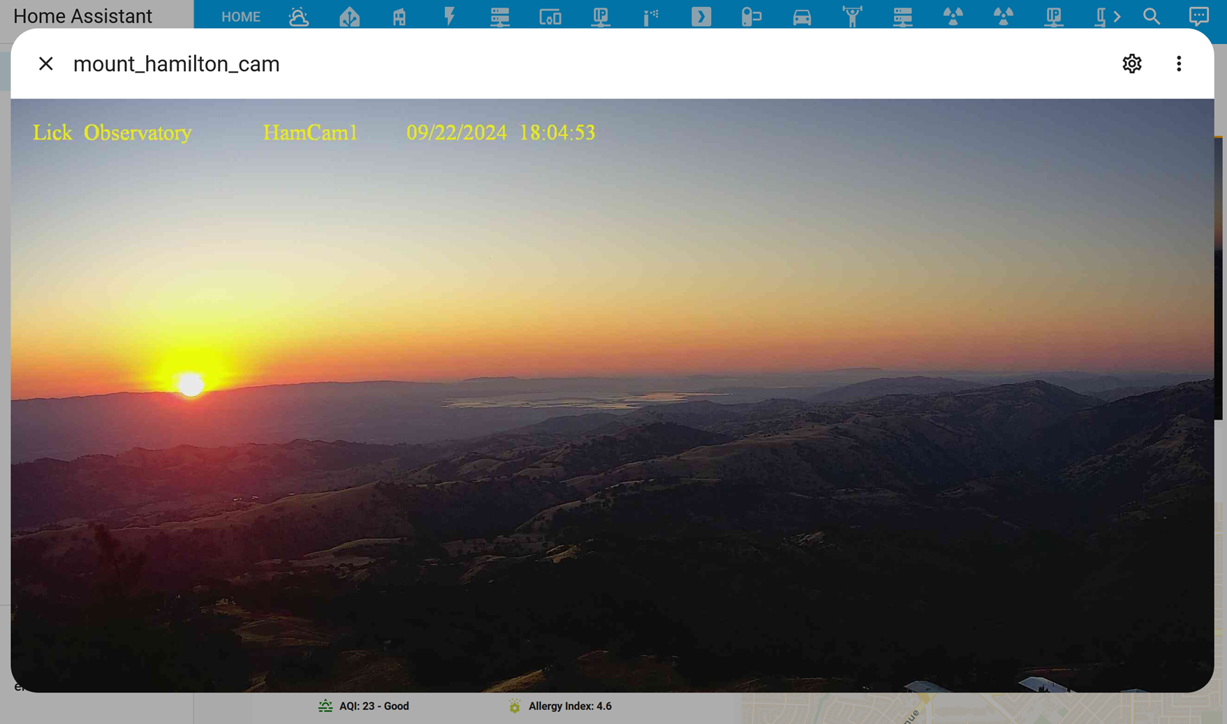
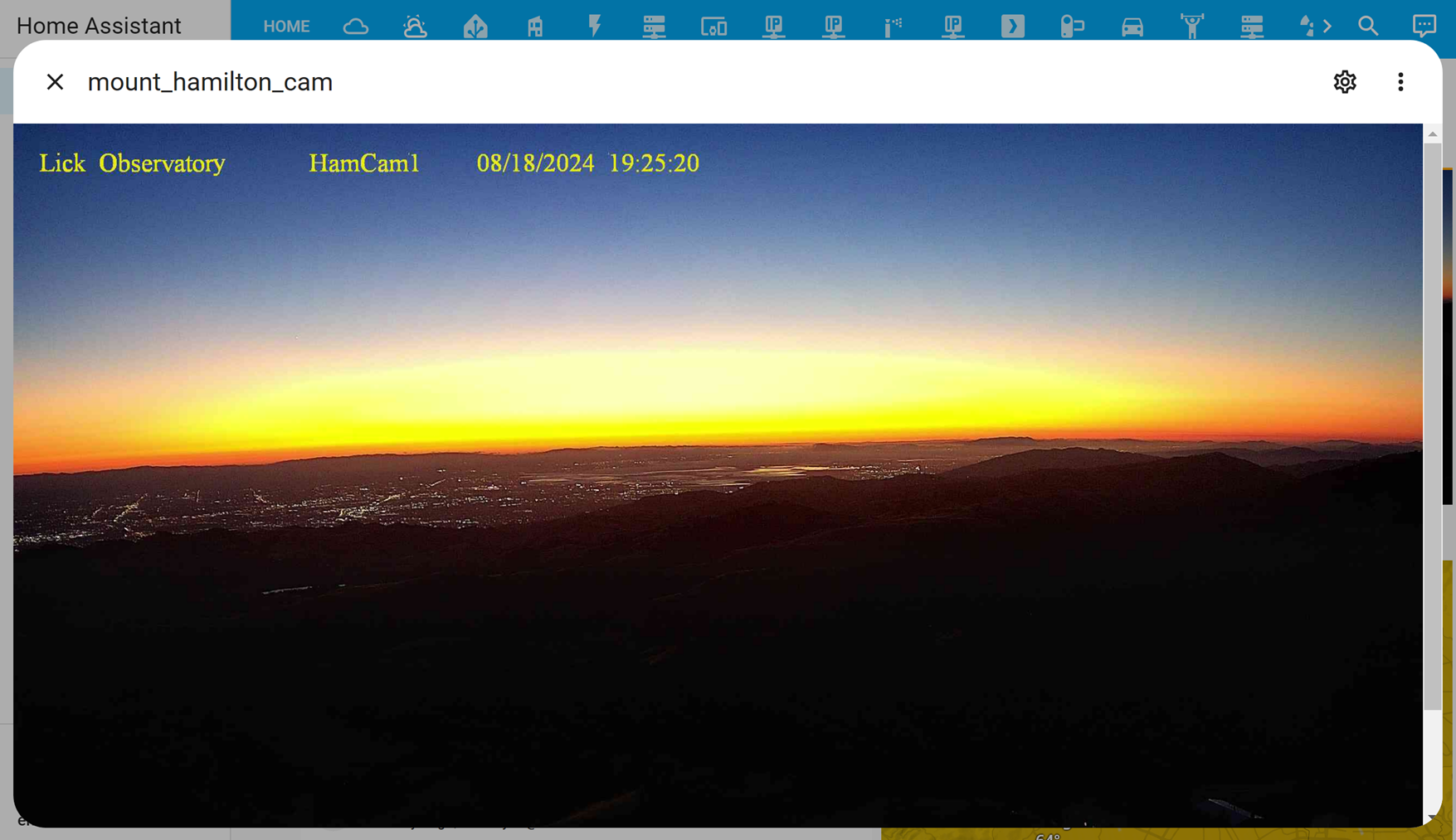
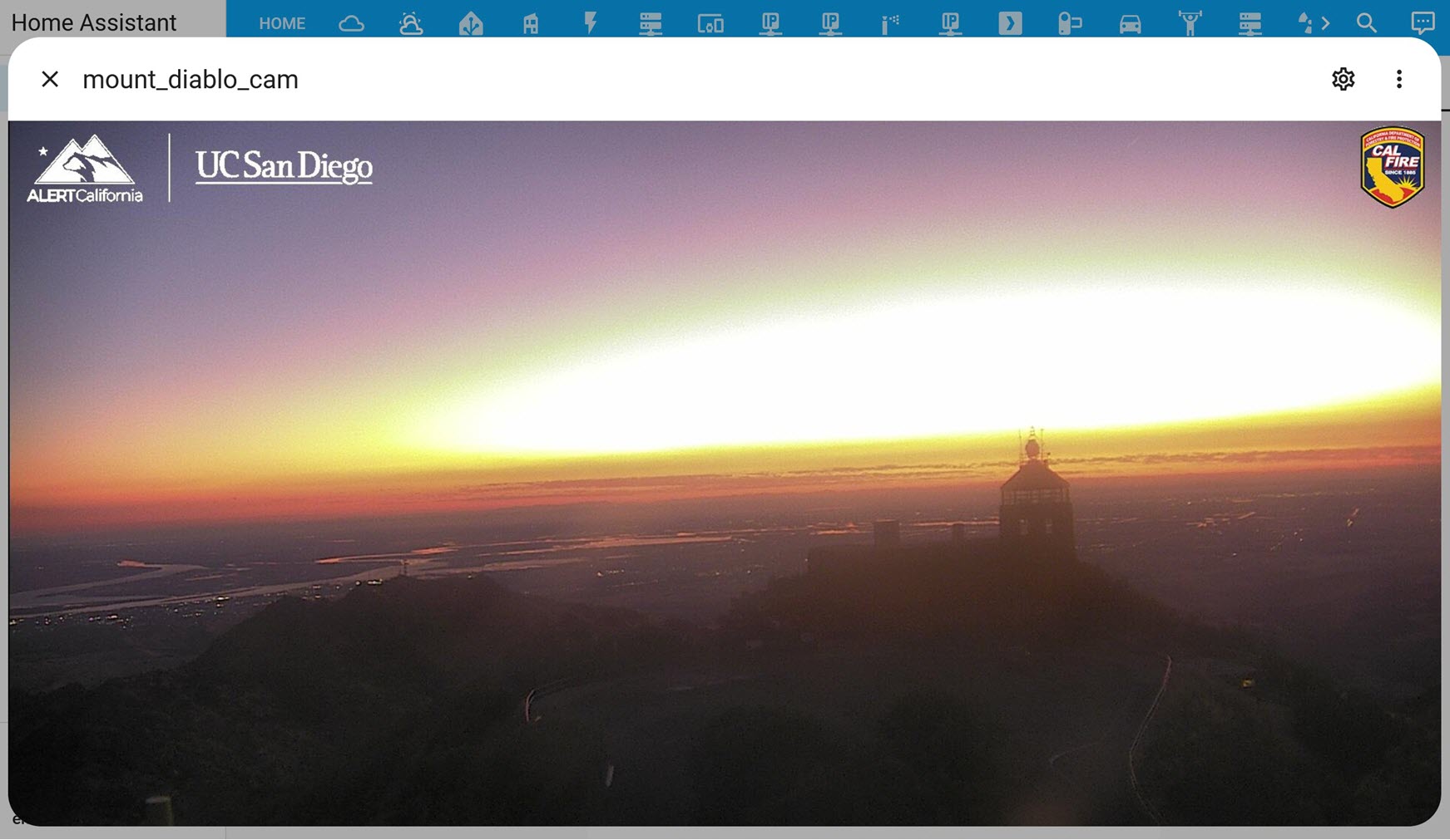
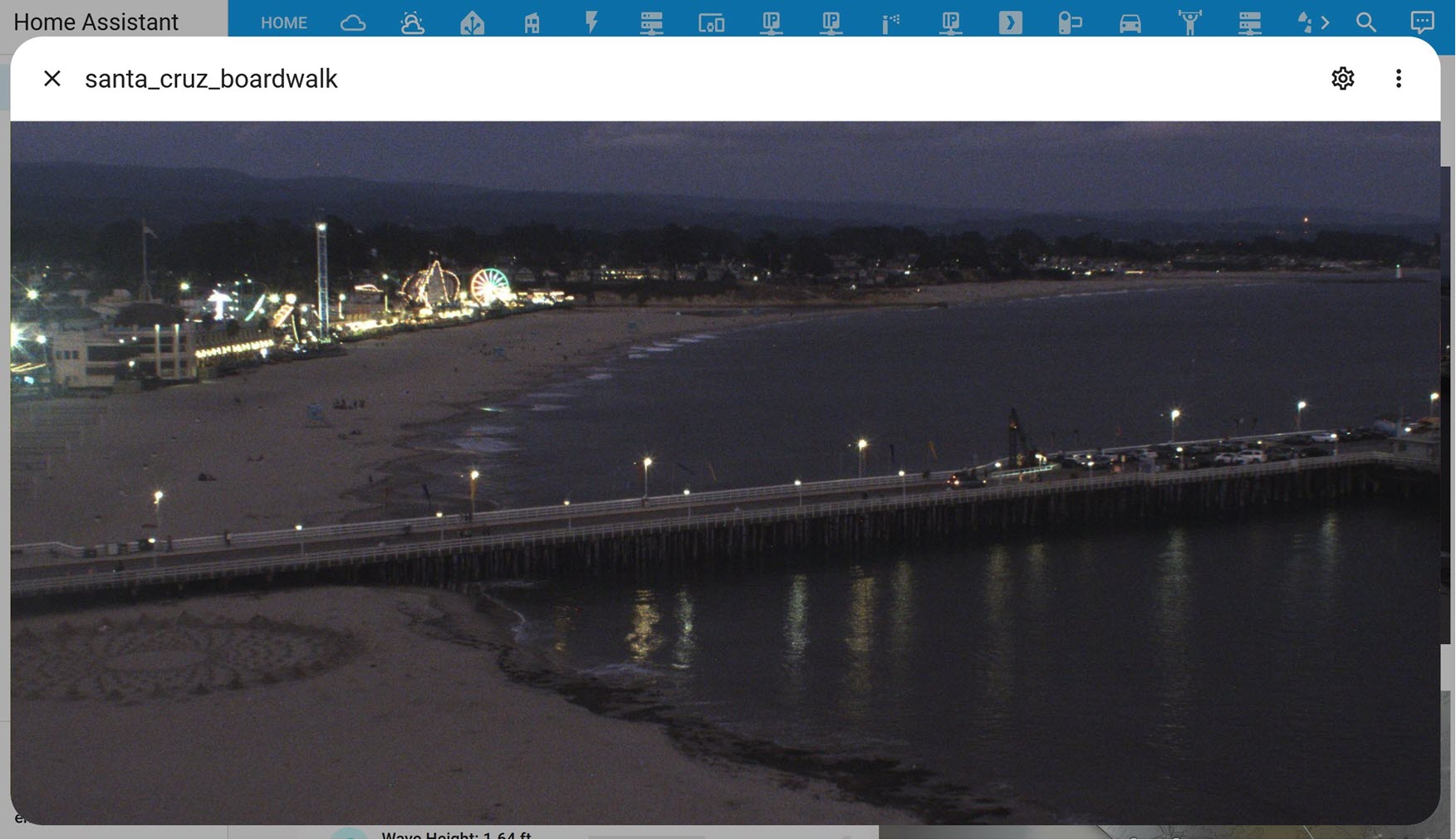
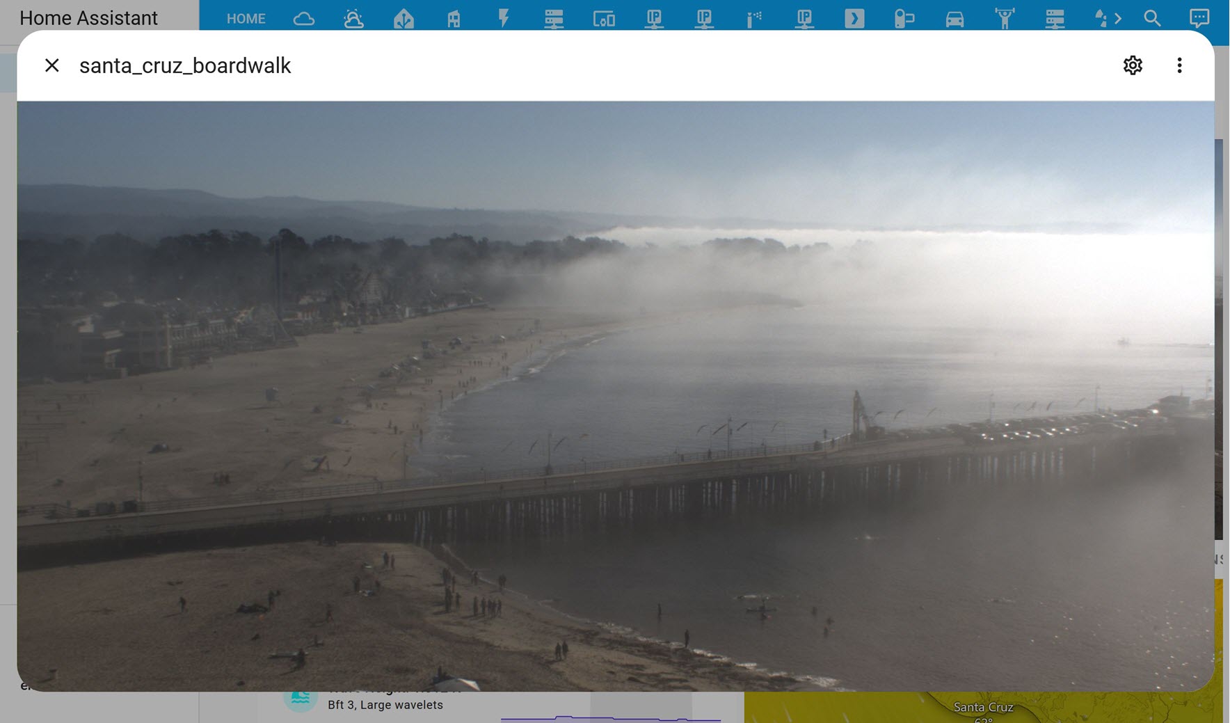
Satellite and Webcam Images: These are configured to refresh every 15mins. Tabs are also used here to support viewing multiple locations. Clicking an image will generate a popup and clicking the popup title will enlarge the image for better viewing (see gif image at the beginning of this document).
(view larger)
Windy.com Charts: These are tabbed (image above, …sorry, it’s only the bottom 20%) and conditionally displayed based on current and forecasted conditions. If it is raining or about to rain, the radar chart will be brought to the forefront, while another chart may be displayed based on a different set of weather conditions (ex. above left - temperature is shown, above right, the radar image is shown).
Other Design Considerations
Ordering: Data is arranged from the top down, left to right with the topleft showing what’s expected to be the most relevant (the current temp and a summary).
Alignment: Secondary level headline information is indented (San Jose tab).
Groupings: As much as possible, like-things are grouped with like-things.
Layout:
Moved to a two column layout instead of the original three. “Headline” data is on the left column and the right column is mostly reserved for satellite images and charts. These changes forced the content to be more focused and minimized scrolling on mobile.
Optimized label sizing and positioning to work equally well for desktop & mobile environments.
Setup
There is a lot going on under-the-hood to collect all of the data and then to display it in Home Assistant. This section details the many integrations used to retrieve the data and the plugins and UI components I’ve used to display it.
Moon: This is a super basic standard integration that only provides the current moon phase. To get more data, I had to create a REST sensor to retrieve the moon’s cycle and position as discussed in this thread.
In some cases, the data I’d like to see is not directly retrievable, but it can be captured over time. My temperature examples from section 2a above for the weekly, monthly, and yearly high temperatures illustrate this point well. Those data points typically are not available (… at least, not without a pro level subscription somewhere) but it’s not that hard to determine their values using a trigger based template sensor. I find it easier to store them in a single sensor as attributes rather than across several different sensors since they are all conceptually related. The max temperature sensor (below) shows this setup. Today’s high is captured as the state value, then all the other temperature elements are stored as separate attributes. The sensor trigger fires when the current temperature is higher than the current state value and then proceeds to evaluate the rest of the attributes and updates them accordingly. This data is then used to populate the max temperature column on the temperature popup*. The yaml to create the sensor entity is here.
(view larger)
*NOTE: The images were taken at different times so the temperature values won’t match exactly.
Data Display (plugins & related components)
This section details the different plugins and related framework support I used to get everything to display as it does in the images in this post. It’s worth mentioning here that everything was done with the UI set to YAML mode. The dynamic elements required extra and often repetitive code. As much as possible, I used the Decluttering card and custom templates to reduce that code as much as I could. Without either of those this likely wouldn’t be maintainable. Here’s a sample of the code for the San Jose tab that then makes calls to the decluttering card template yaml.
Decluttering card: Provides support for variable declaration and reuse of lovelace code blocks. Benefits: big reduction of repetitive code which reduces size and improves reliably since the same code can be used throughout. This dashboard would be very difficult to maintain without this card.
This is the least developed tab out of the three. I may build it out some more when I decide to make the time, but the main reason for showing it is to illustrate how the weather information is organized when a location doesn’t have a dedicated tab like I did for San Jose and Santa Cruz. The tab itself is pretty plain right now. Clicking any of the three named locations will create a popup.
This is the popup I have for the Lake Tahoe region (Soda Springs in the image). It has elements I placed at the tab level on other tabs and some of the interactive elements from the popups.
Fun Stuff
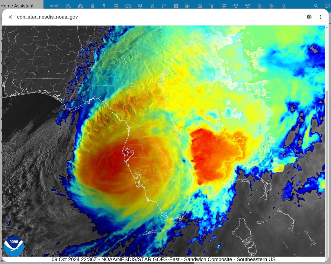
I’ve really enjoyed adding the satellite images from NOAA and various webcams to my dashboard. It clearly makes it more dynamic and you never know what you are going to see. Here’s a few of my favorites from the last few months.
Hurricane milton making landfall over Florida (October 2024):